BRAND SYSTEM / LUXURY FASHION SILK GARMENTS
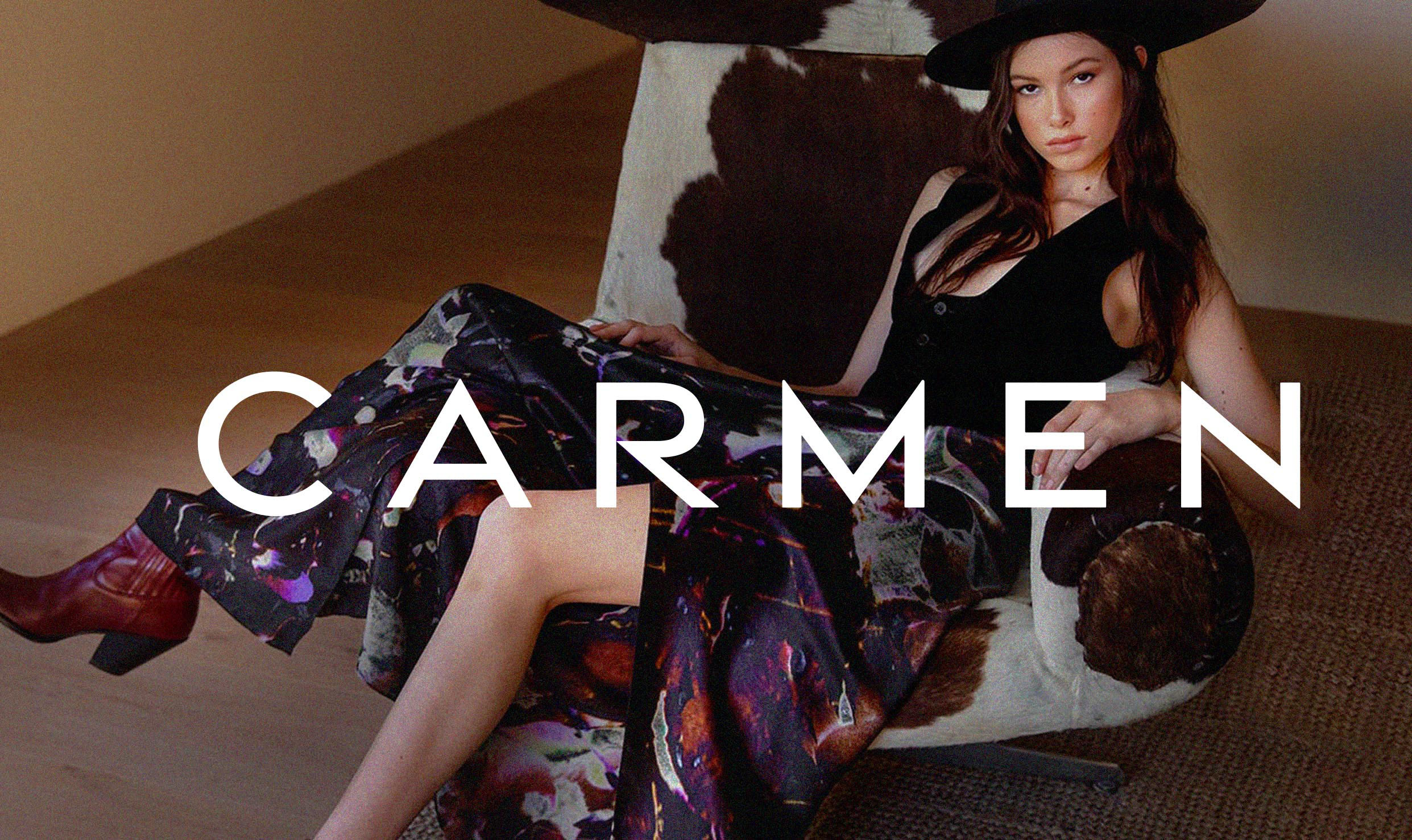
CARMEN
 ART DIRECTOR
 Carmen Molina is a photographer based in Los Angeles who translates her photographic art onto silk. In 2024, she ventured into the world of fashion and design goods with the launch of her own brand. Carmen hired me to develop her entire brand identity. Given the project's early stages, I initially worked as a consultant to define the brand's DNA. Through extensive collaborative sessions, we identified the unique characteristics Carmen wished to convey through her luxury products and art. This foundational understanding guided the subsequent design process.
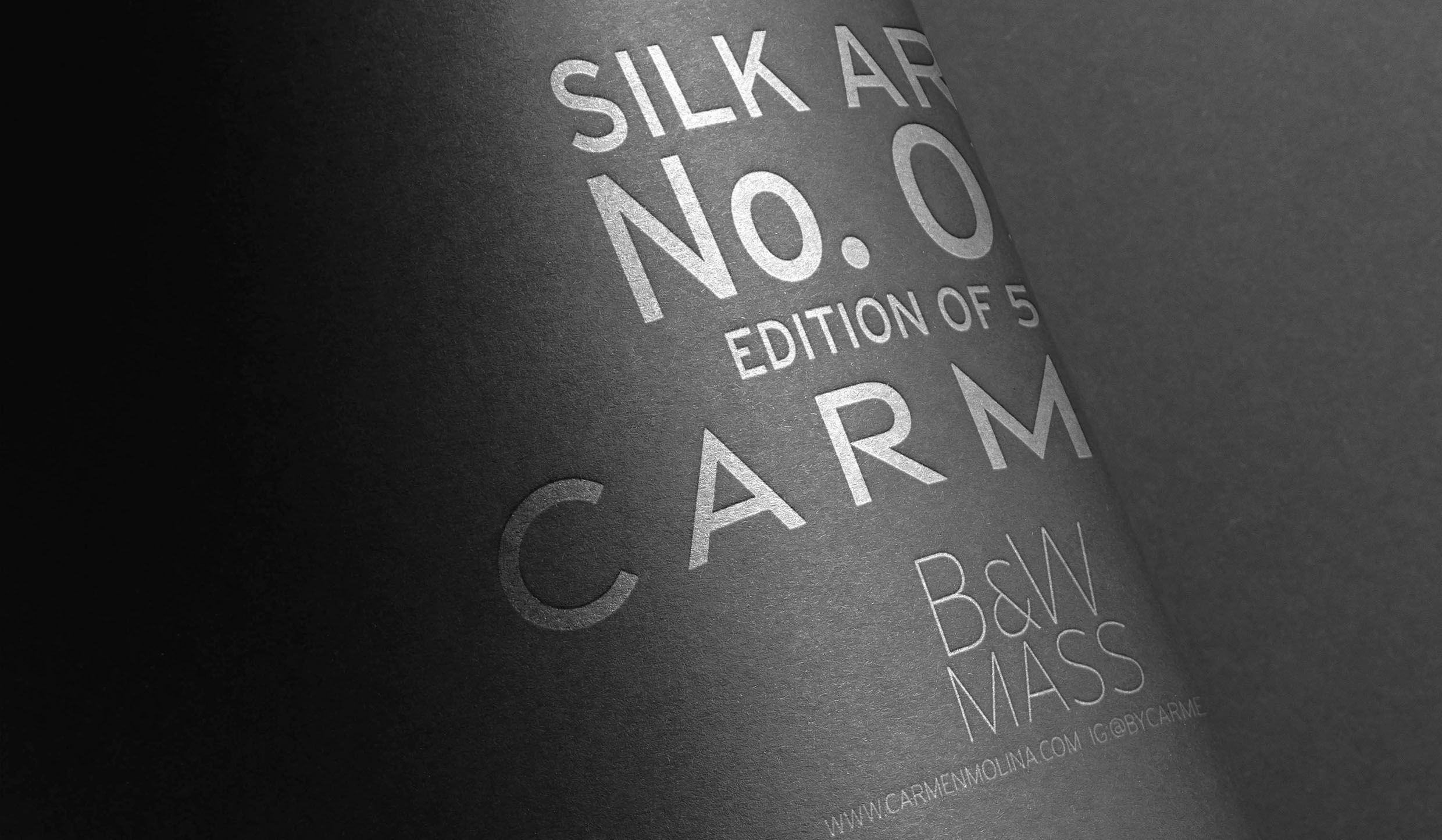
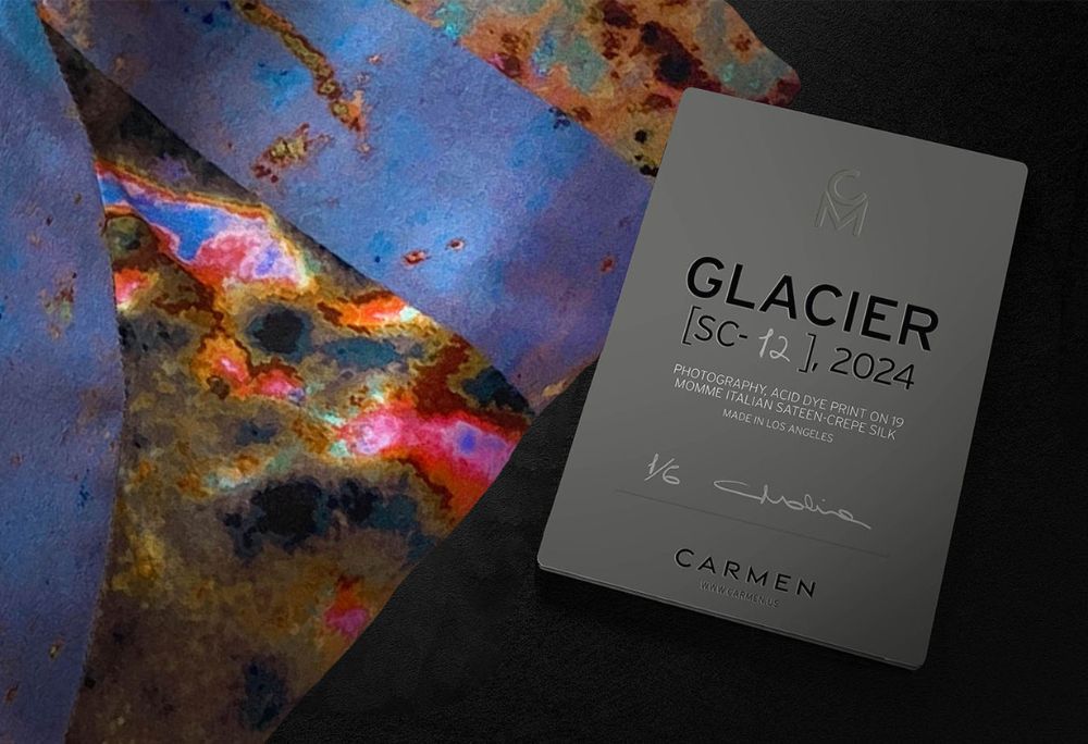
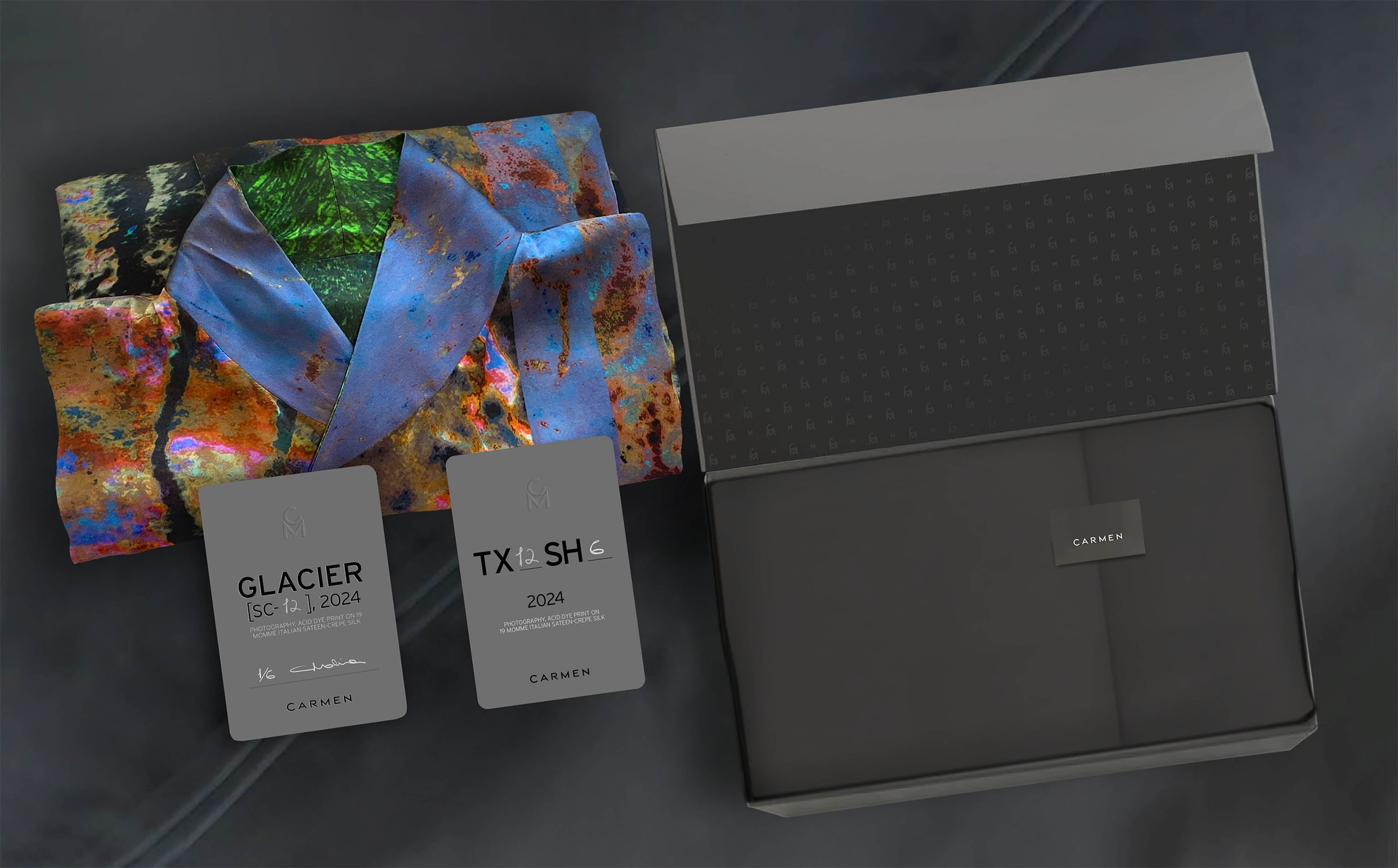
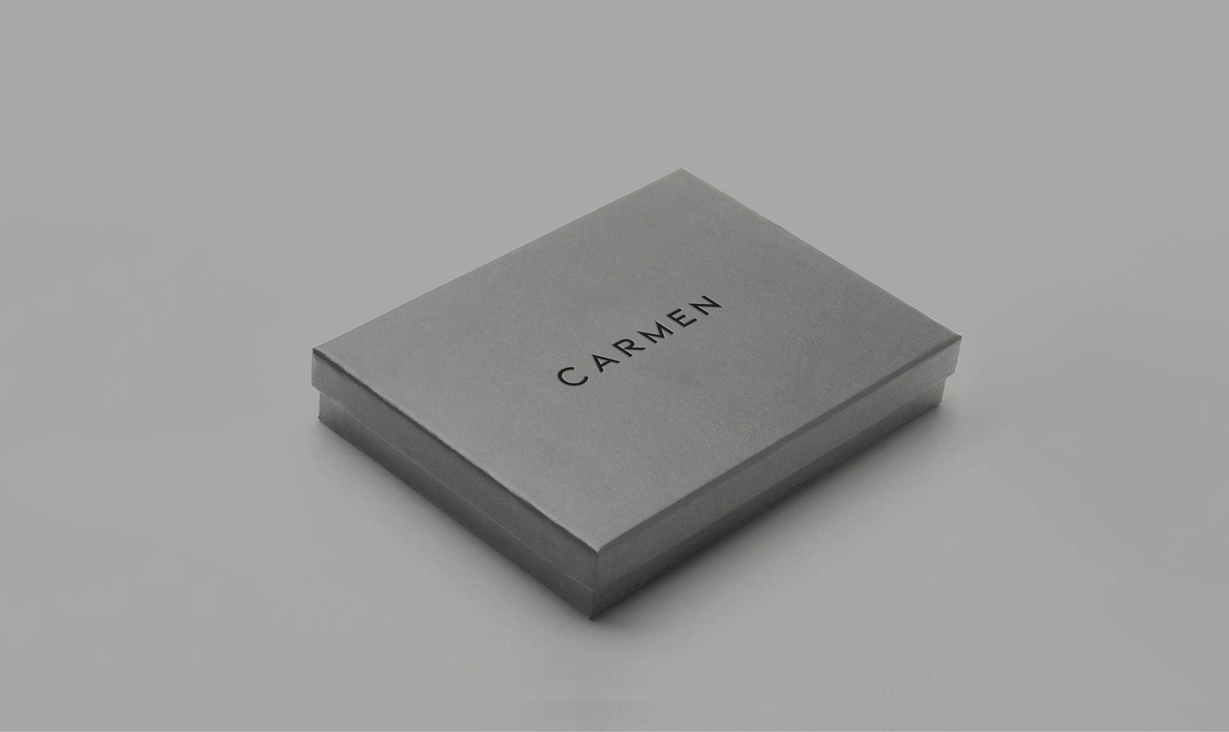
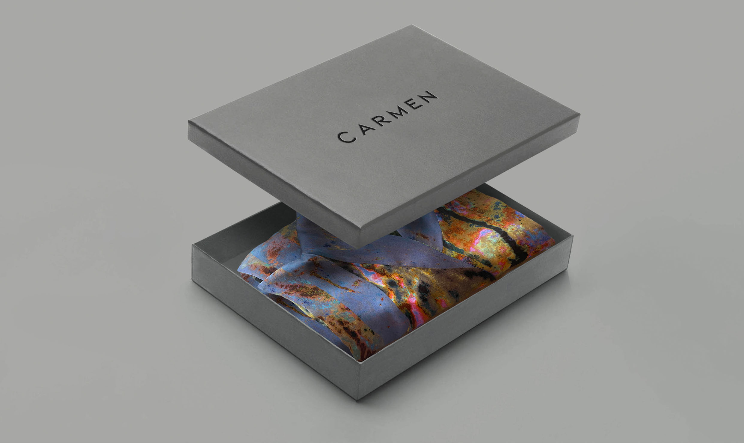
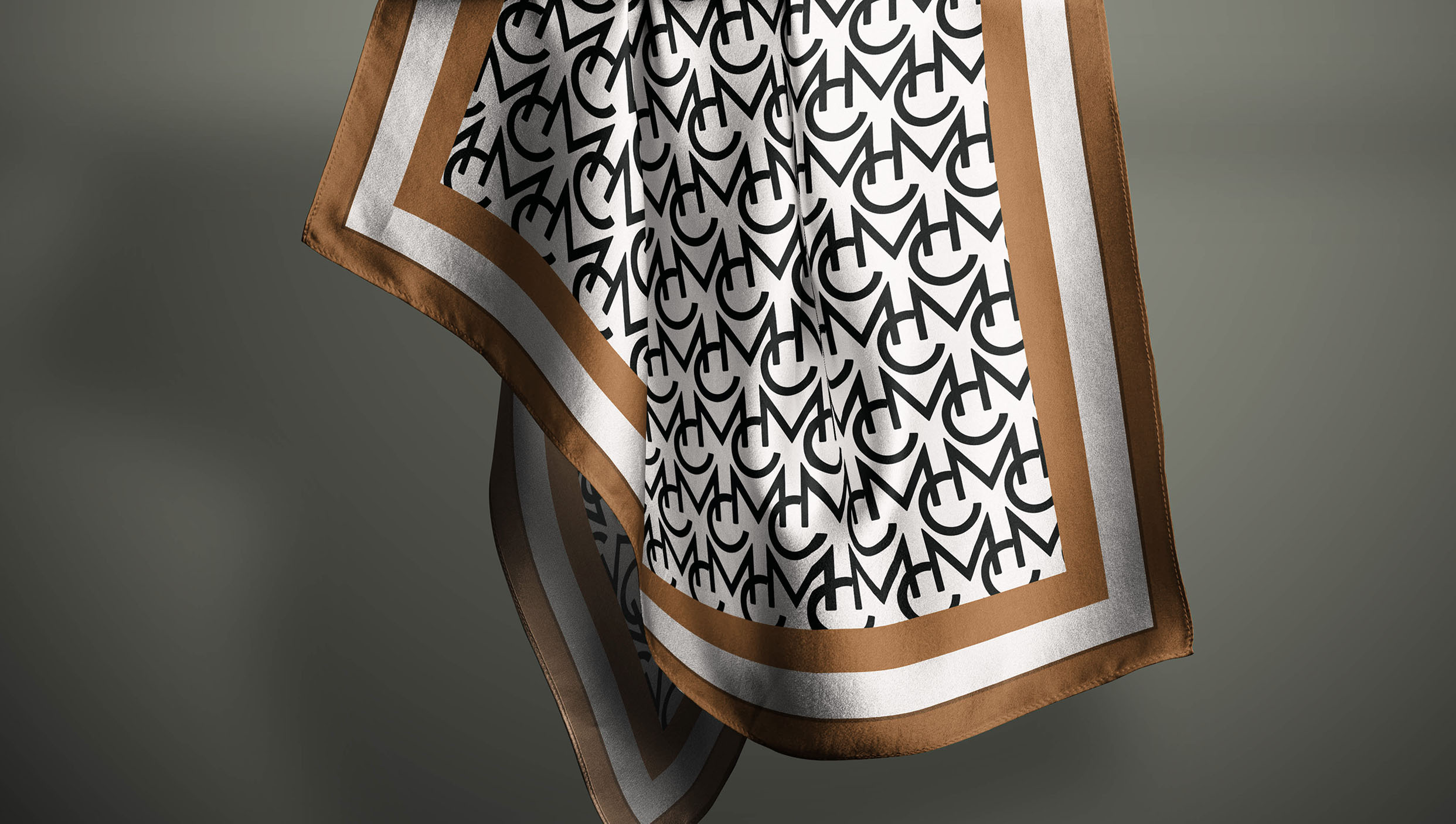
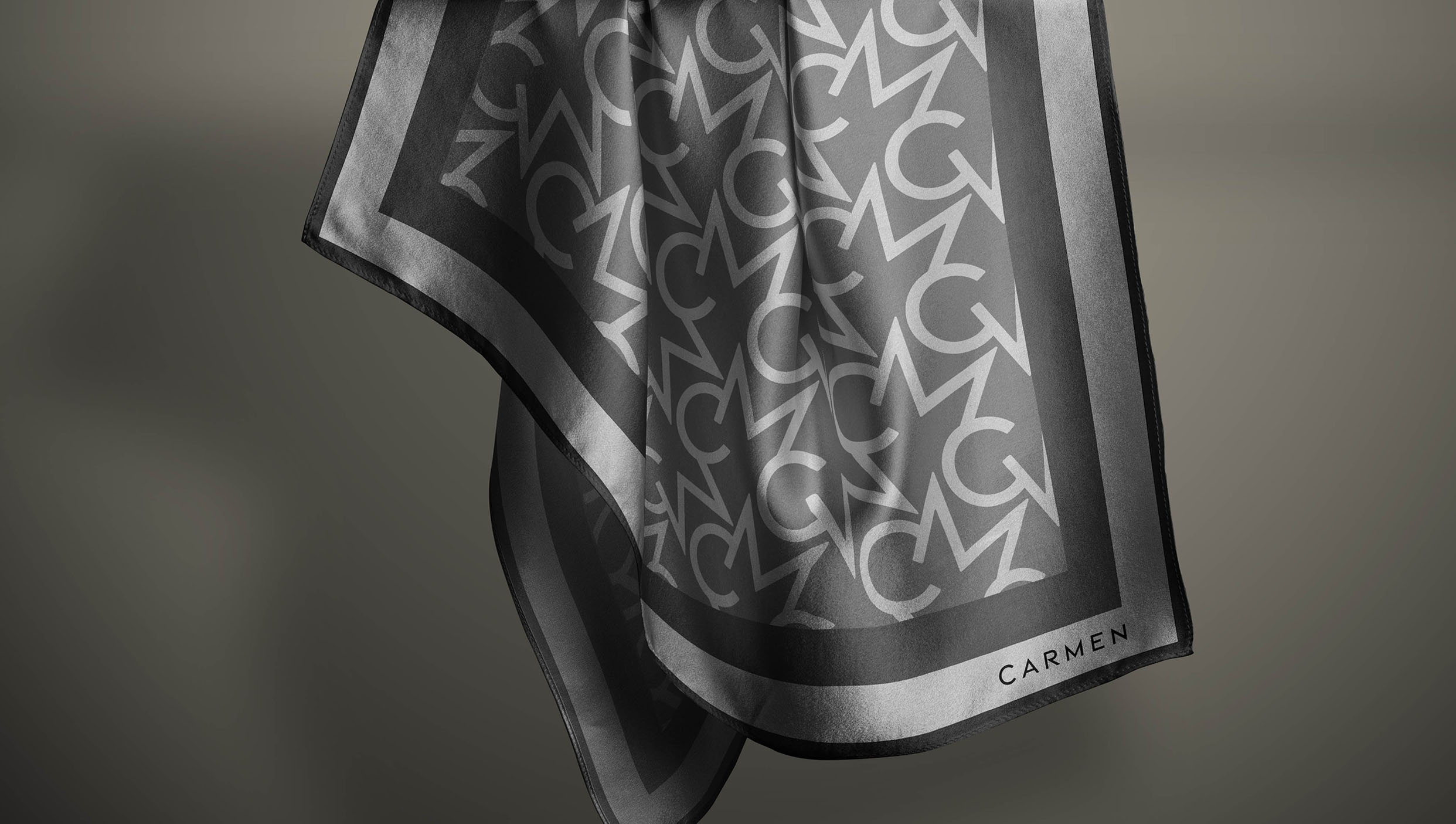
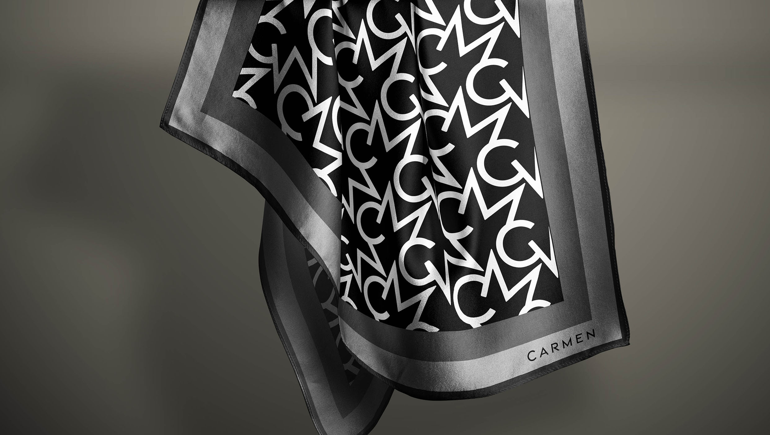
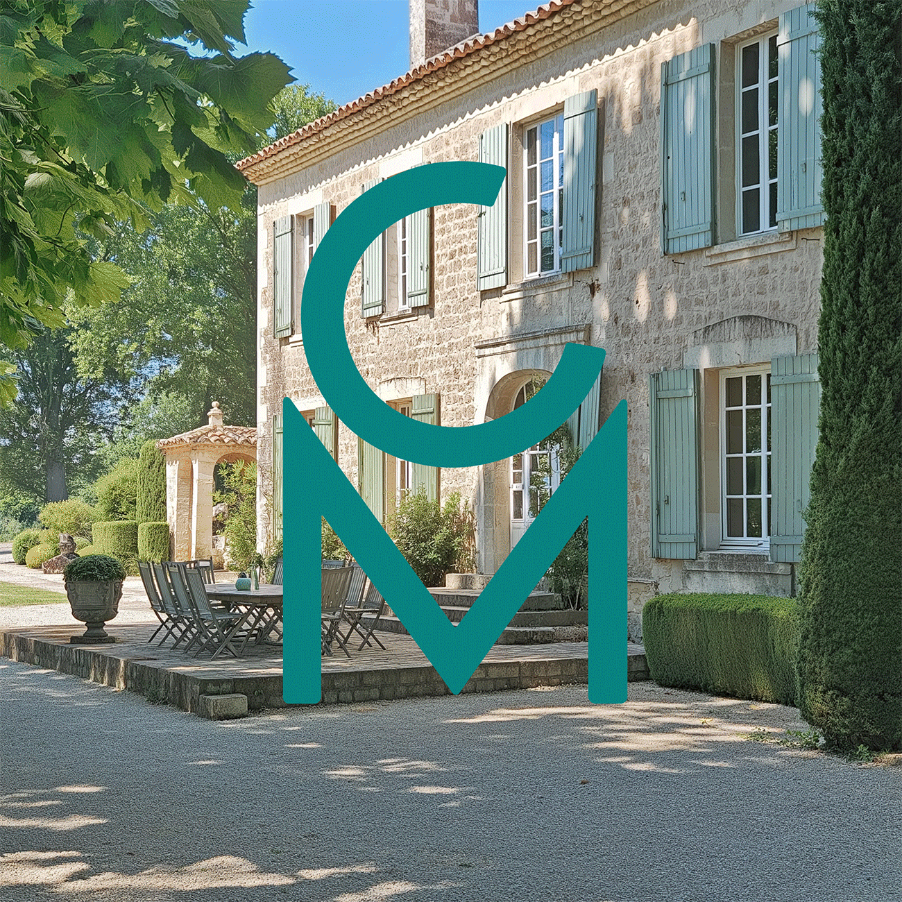
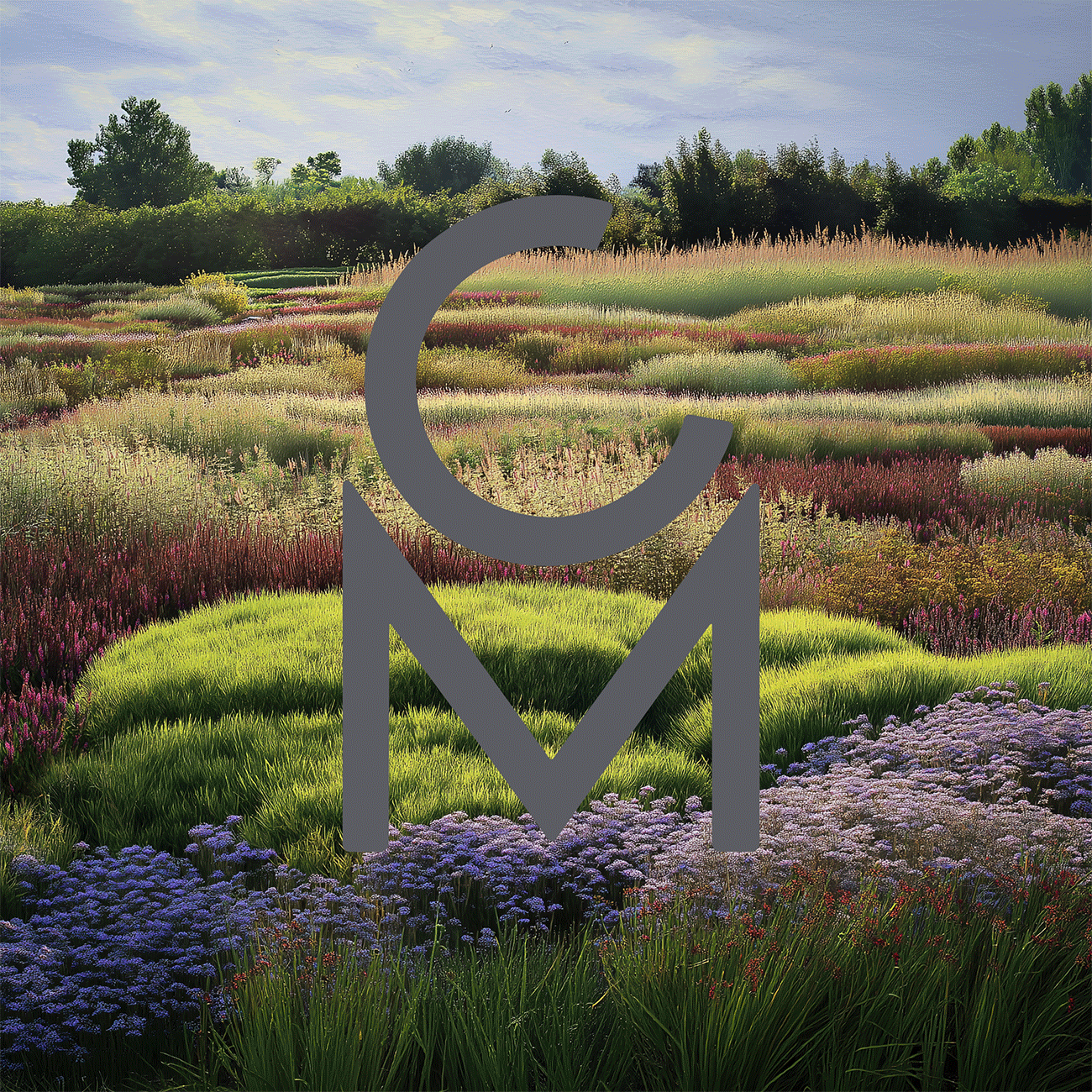
Following the establishment of Carmen Molina's brand DNA, I proposed and executed a comprehensive visual identity, designing the entire graphic system. This included labels, stationery, a bespoke typography for her logo, a monogram, and iconography. To further define the brand's aesthetic, I created detailed moodboards with categories such as architecture, furniture, objects, materials, and locations. These moodboards helped to expand the art direction and provide a clearer, more authentic visual world for the brand. Additionally, I crafted pattern designs, established guidelines for typographic usage, and designed an unboxing experience.
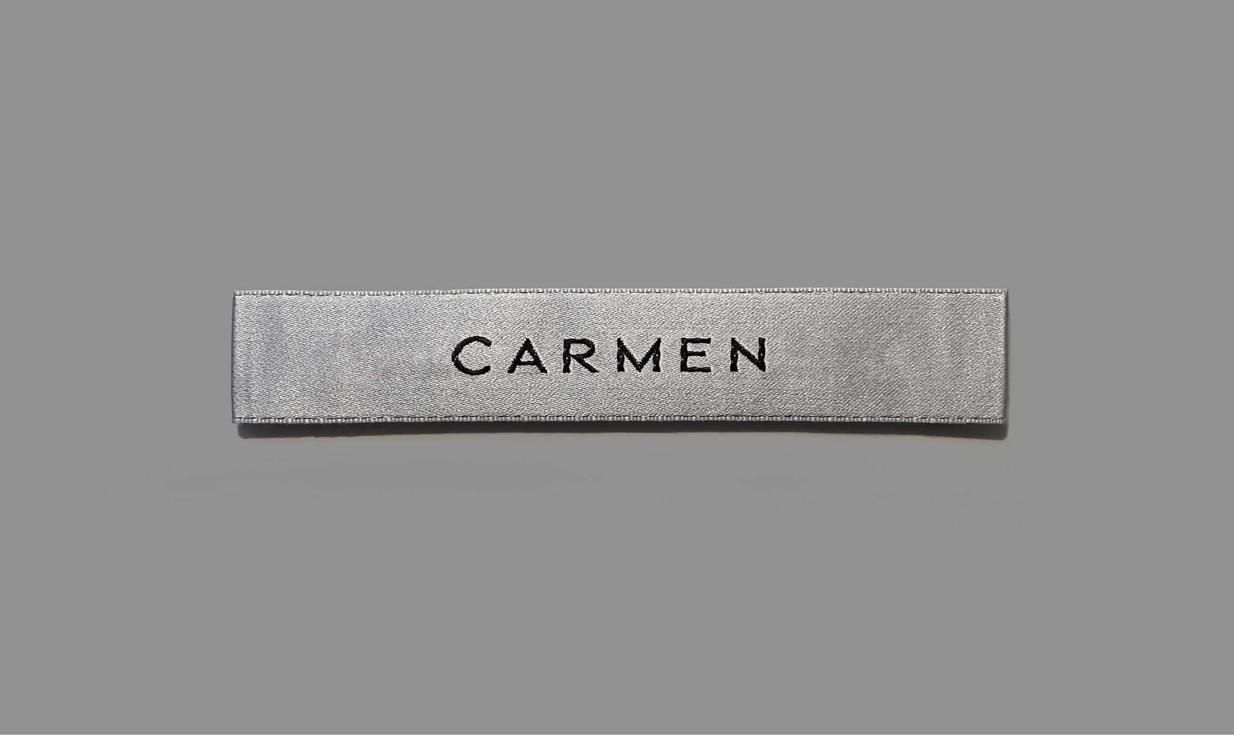
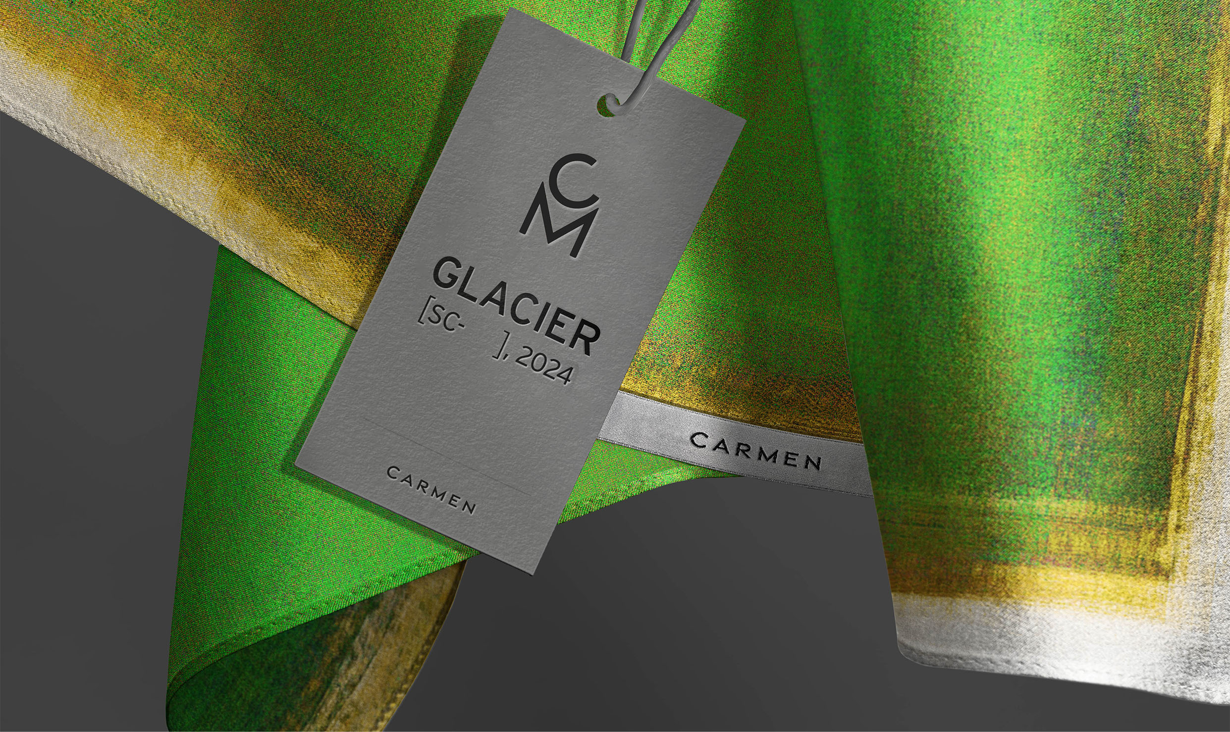
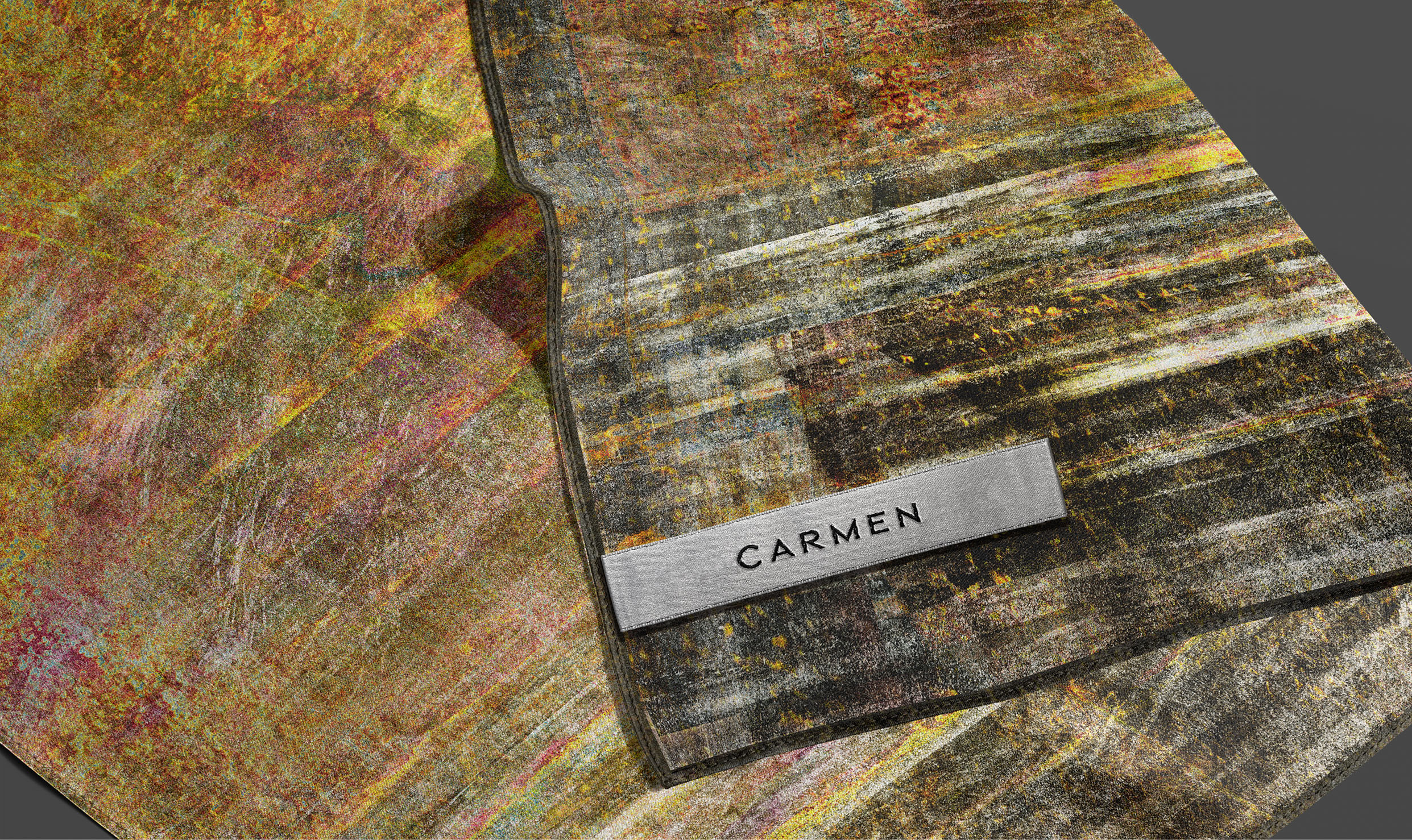
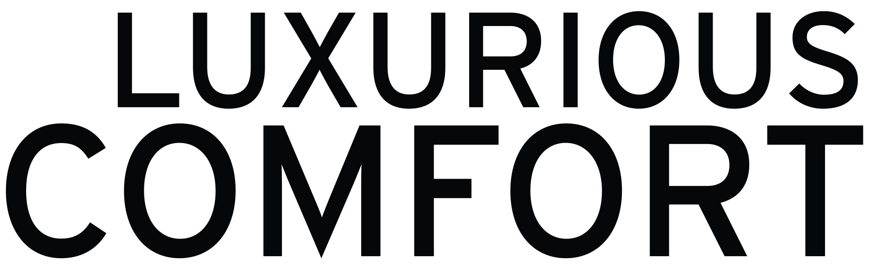
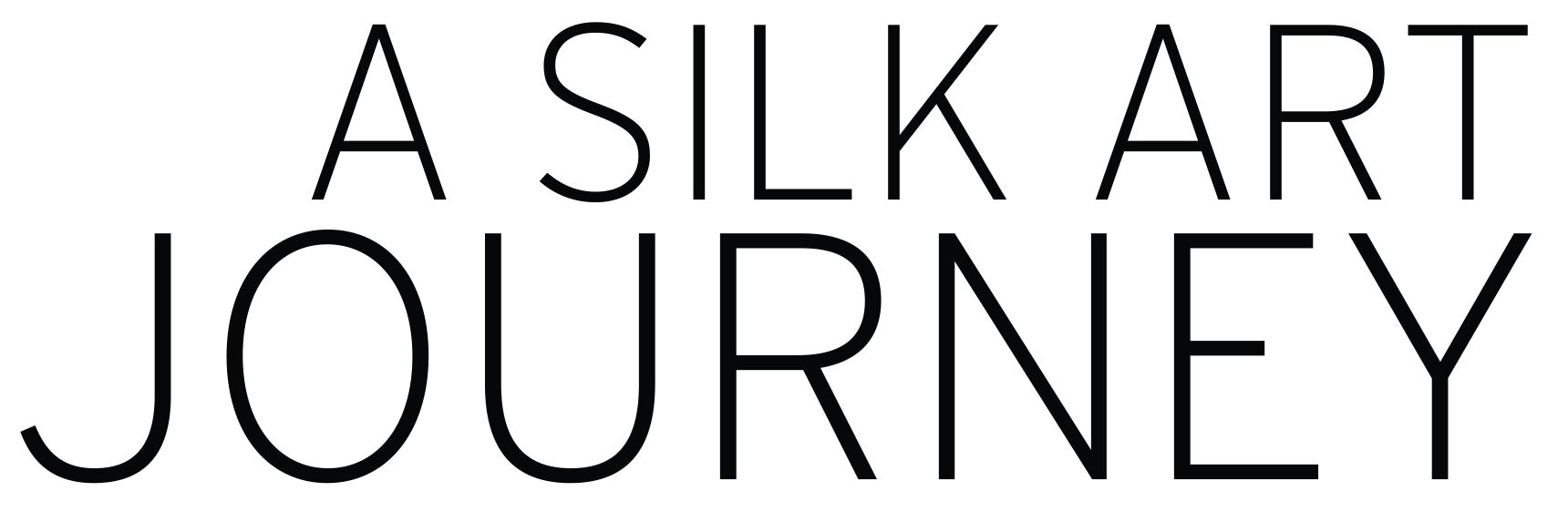
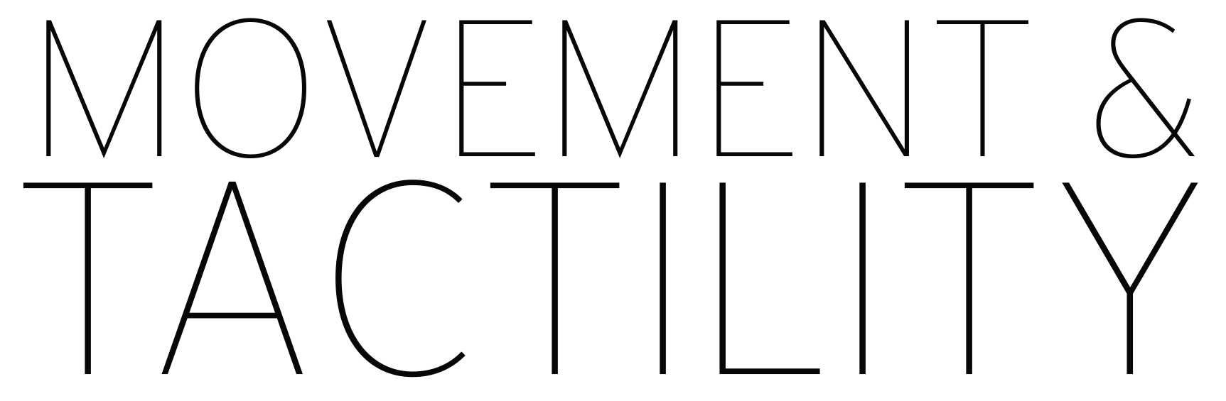
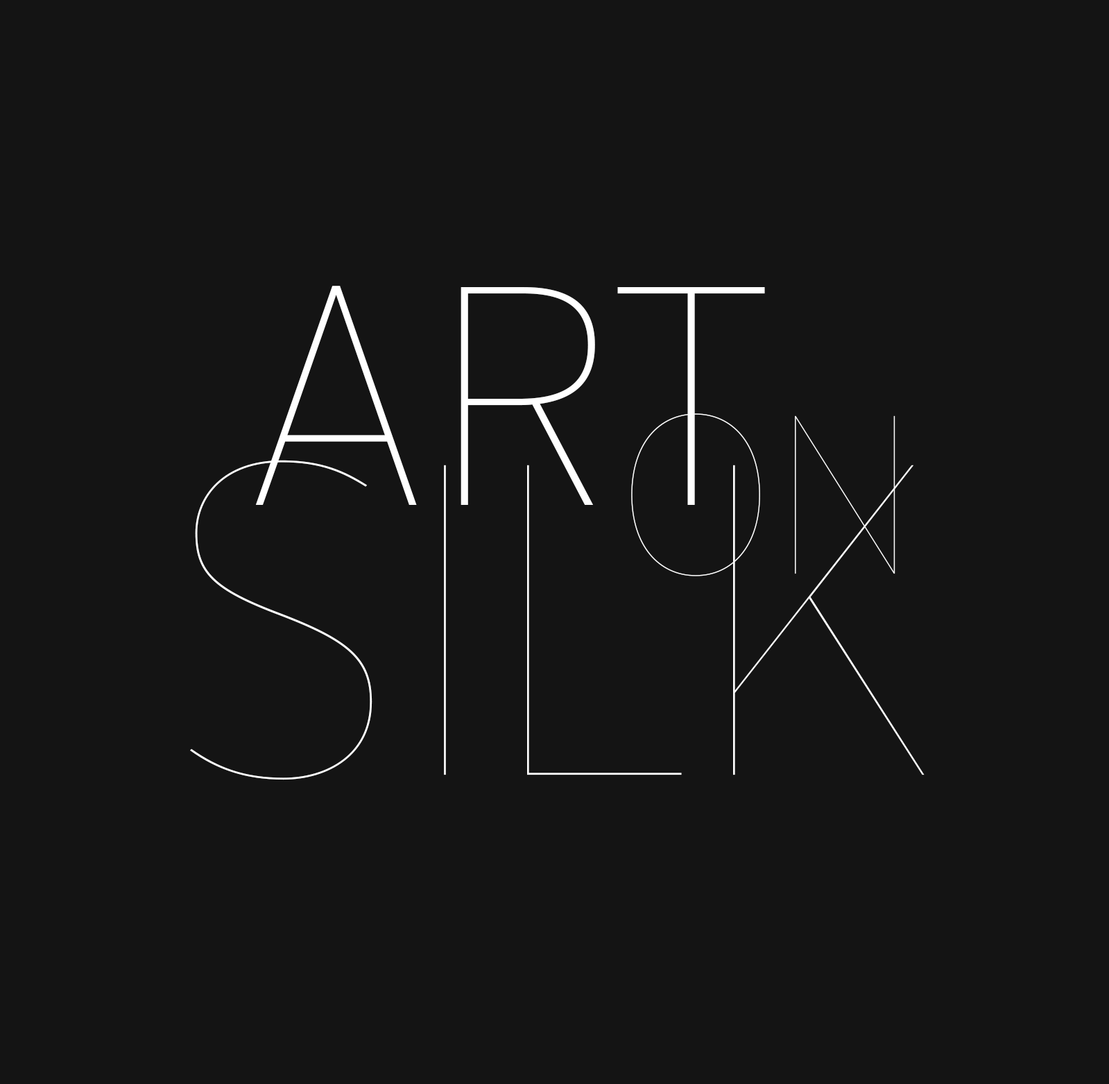
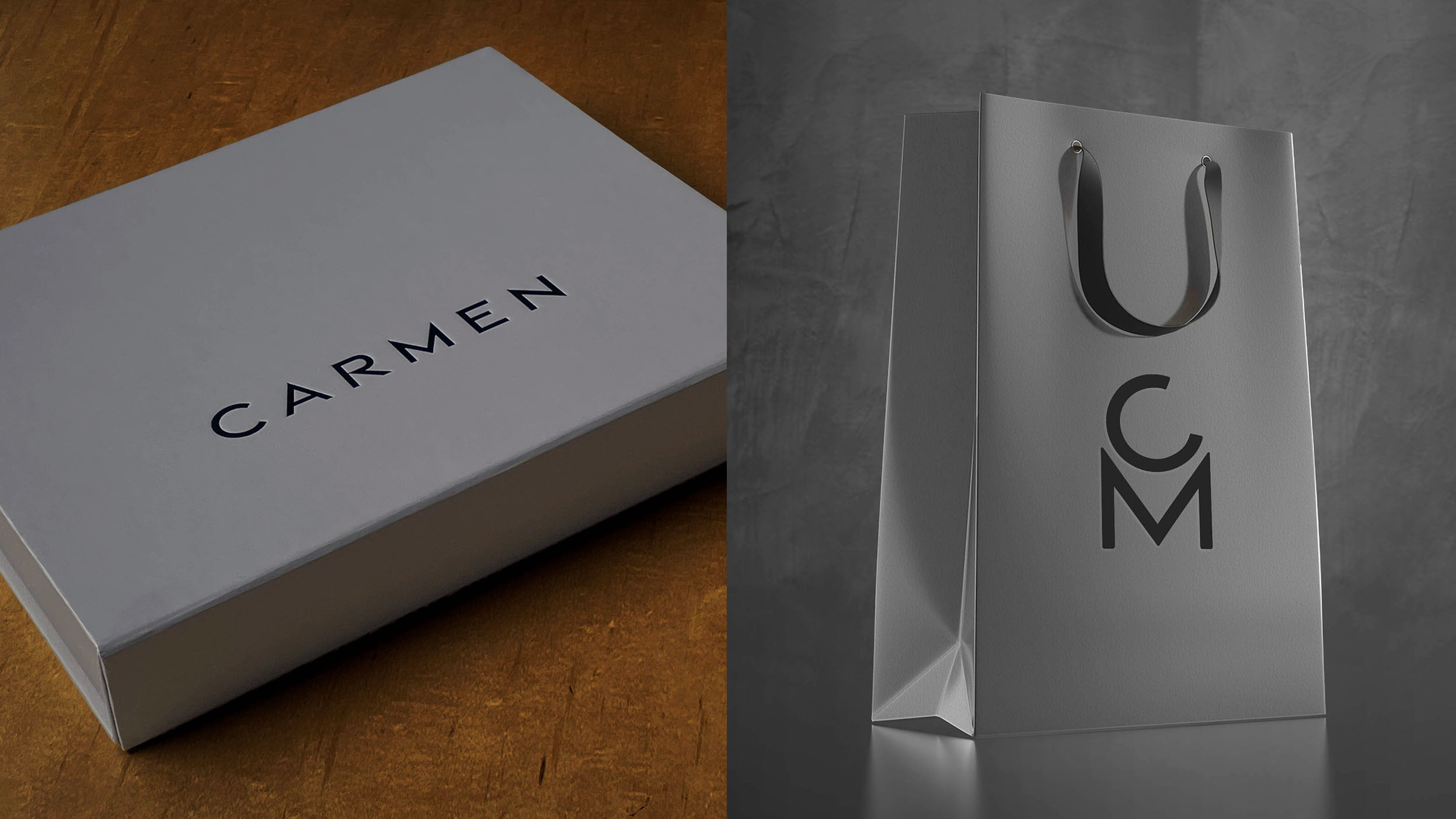
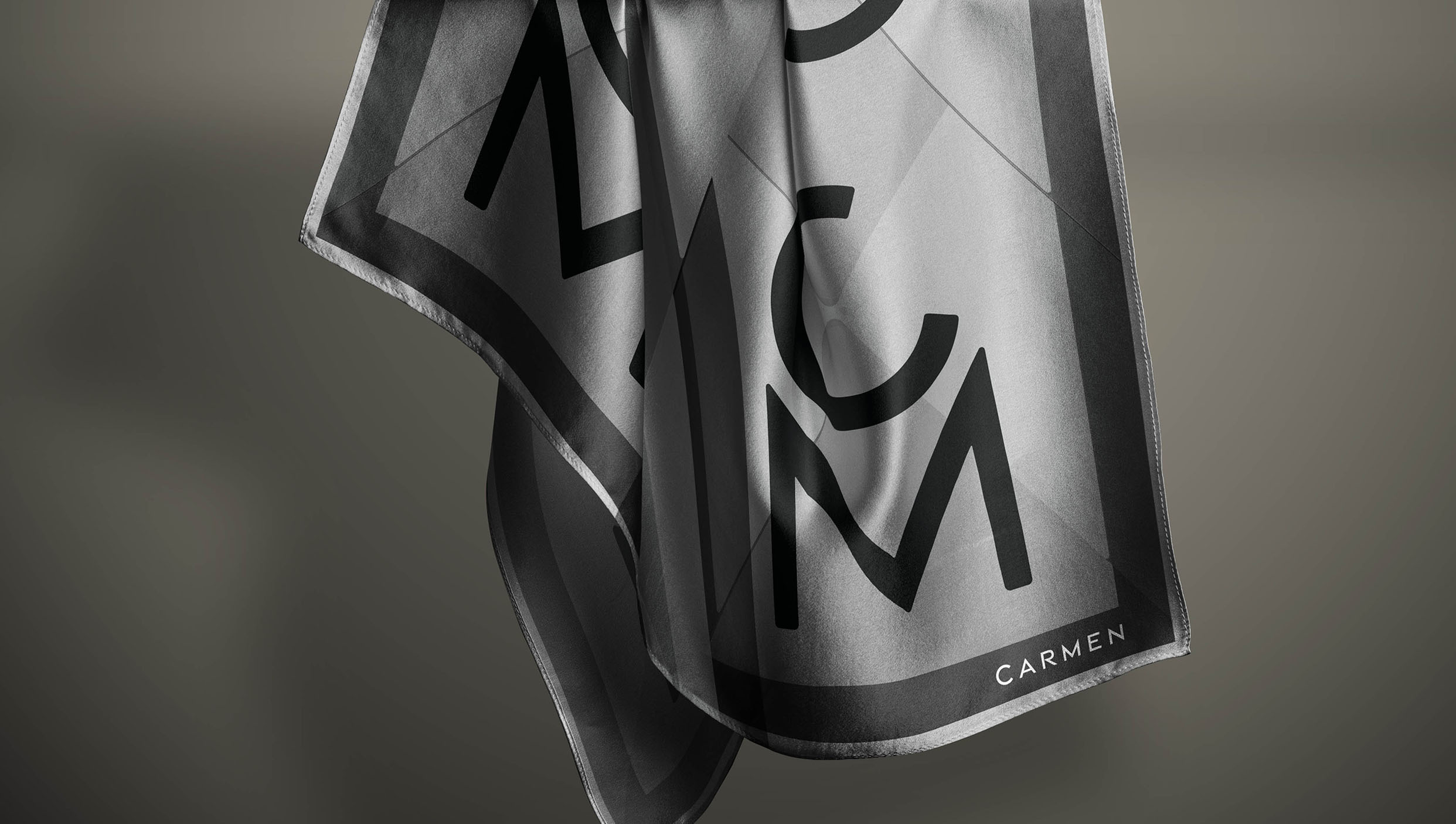
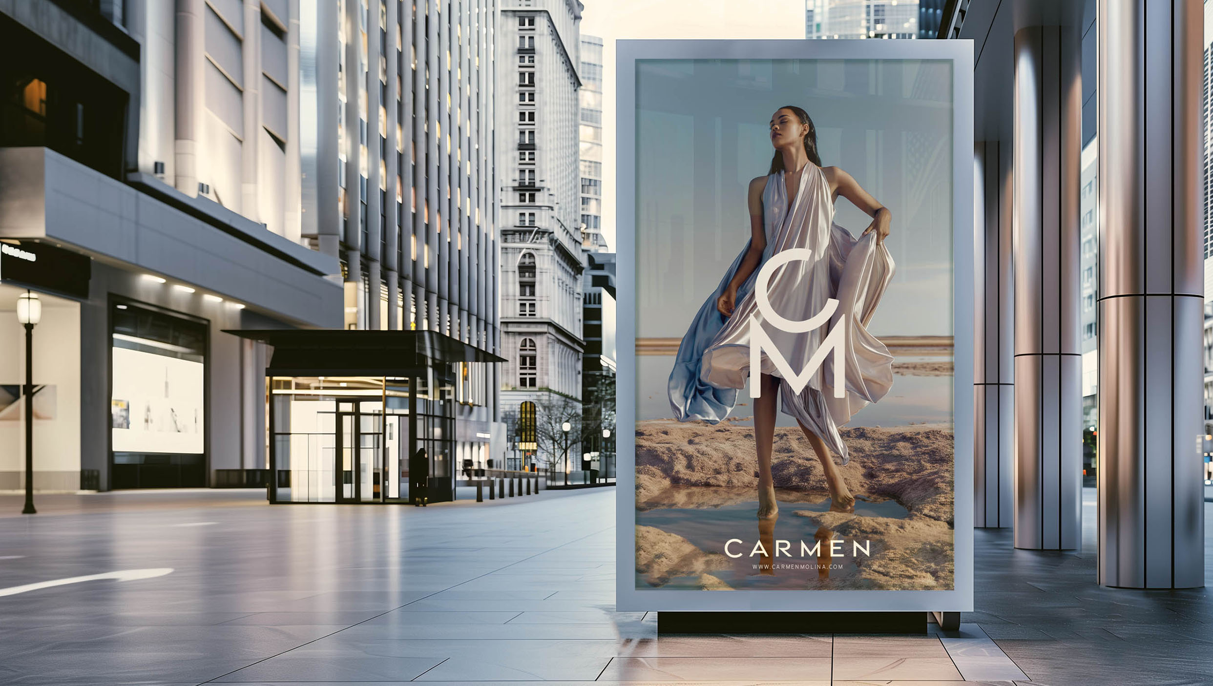
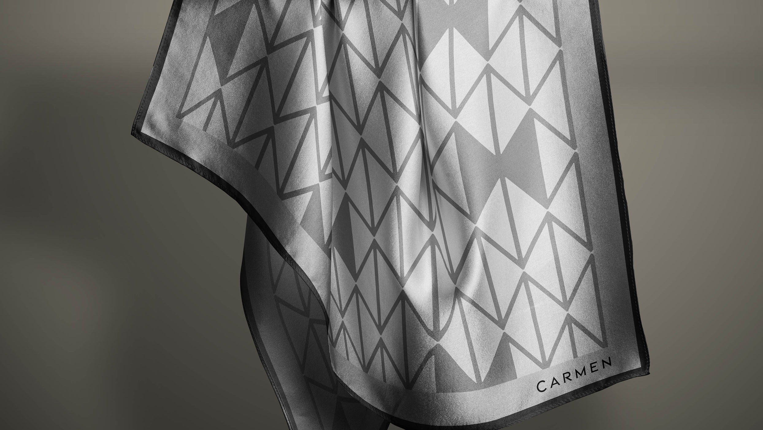
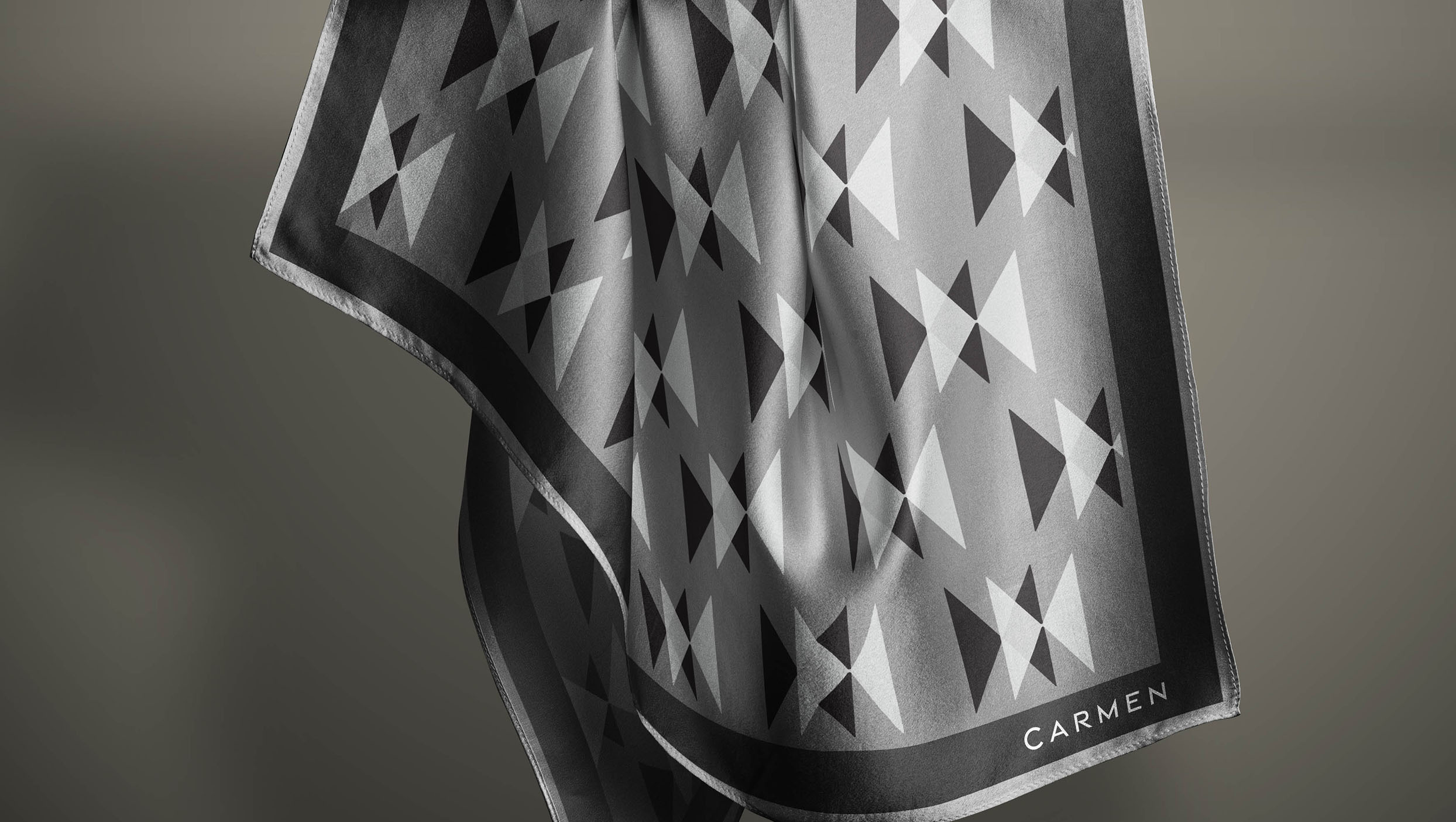
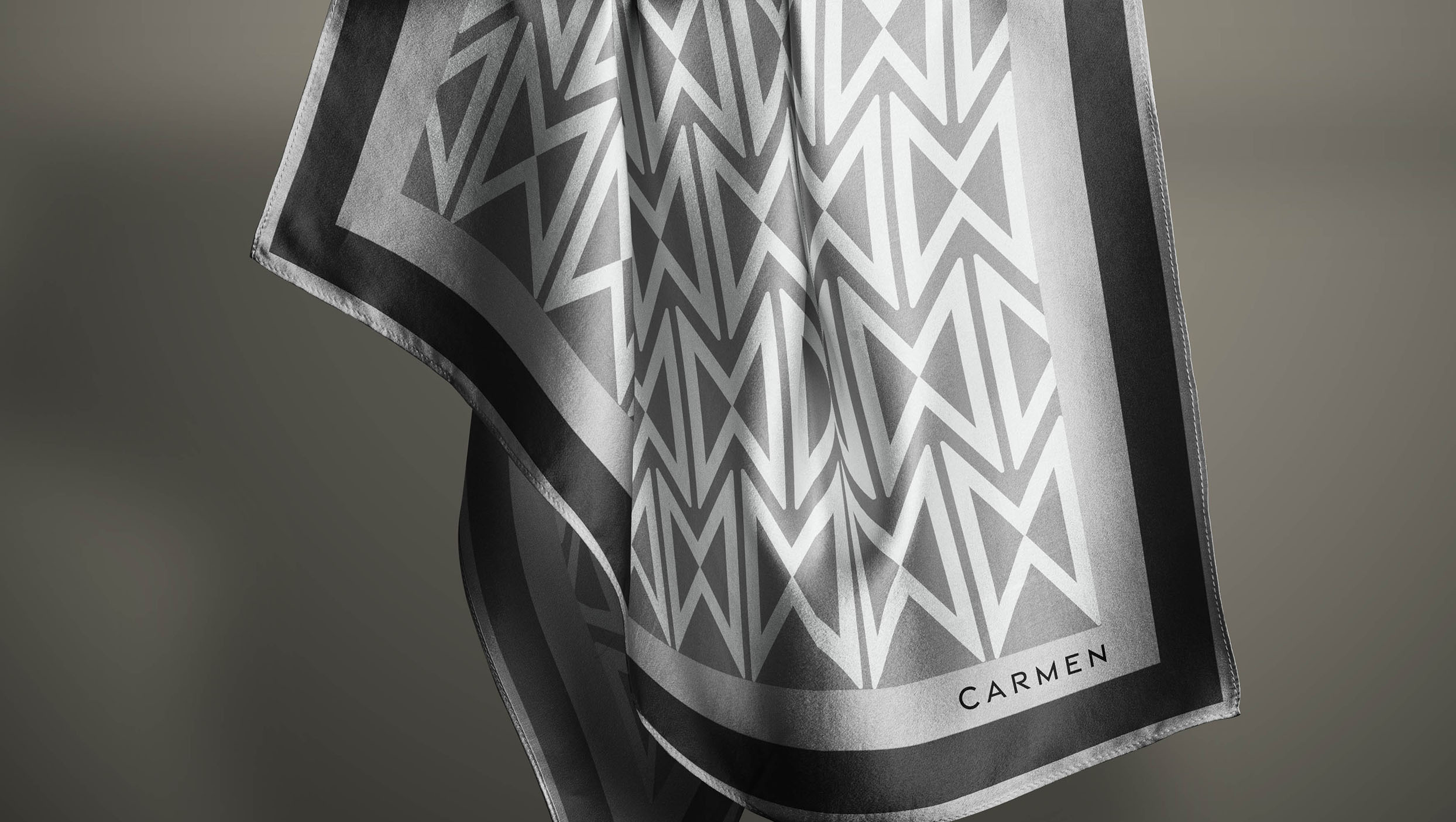
Carmen's work explores the nuances of textures, colors, and shades. I focused on creating a frame for her art — a simple, timeless brand with multiple elements that allow her vibrant, textured prints to take center stage. The typography is inspired by simple geometric shapes with soft, rounded edges. The monogram is bold and playful, symbolizing the harmony of the earthly and the inspirational: the 'M' is grounded, representing the material world, while the 'C,' like a crescent moon, hovers above, reflecting the source of creative inspiration.
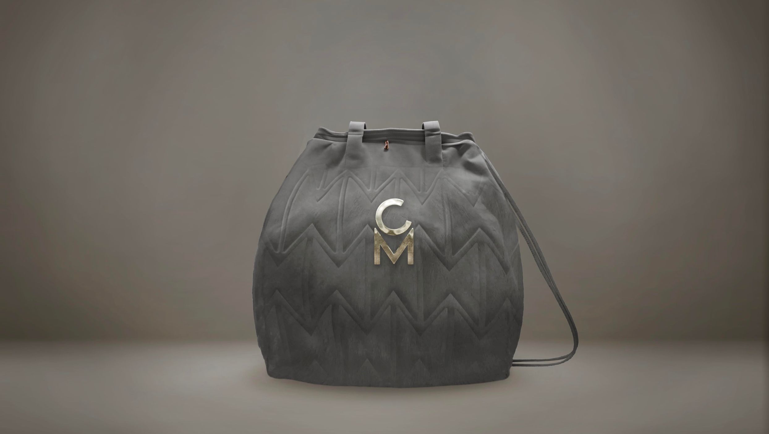
This versatile monogram is designed to be widely used across various applications, from garment hardware and trims to different materials and finishes, seamlessly integrating into her clothing, bags, and shoes. It serves as a signature element that ties together all aspects of her brand's visual identity.
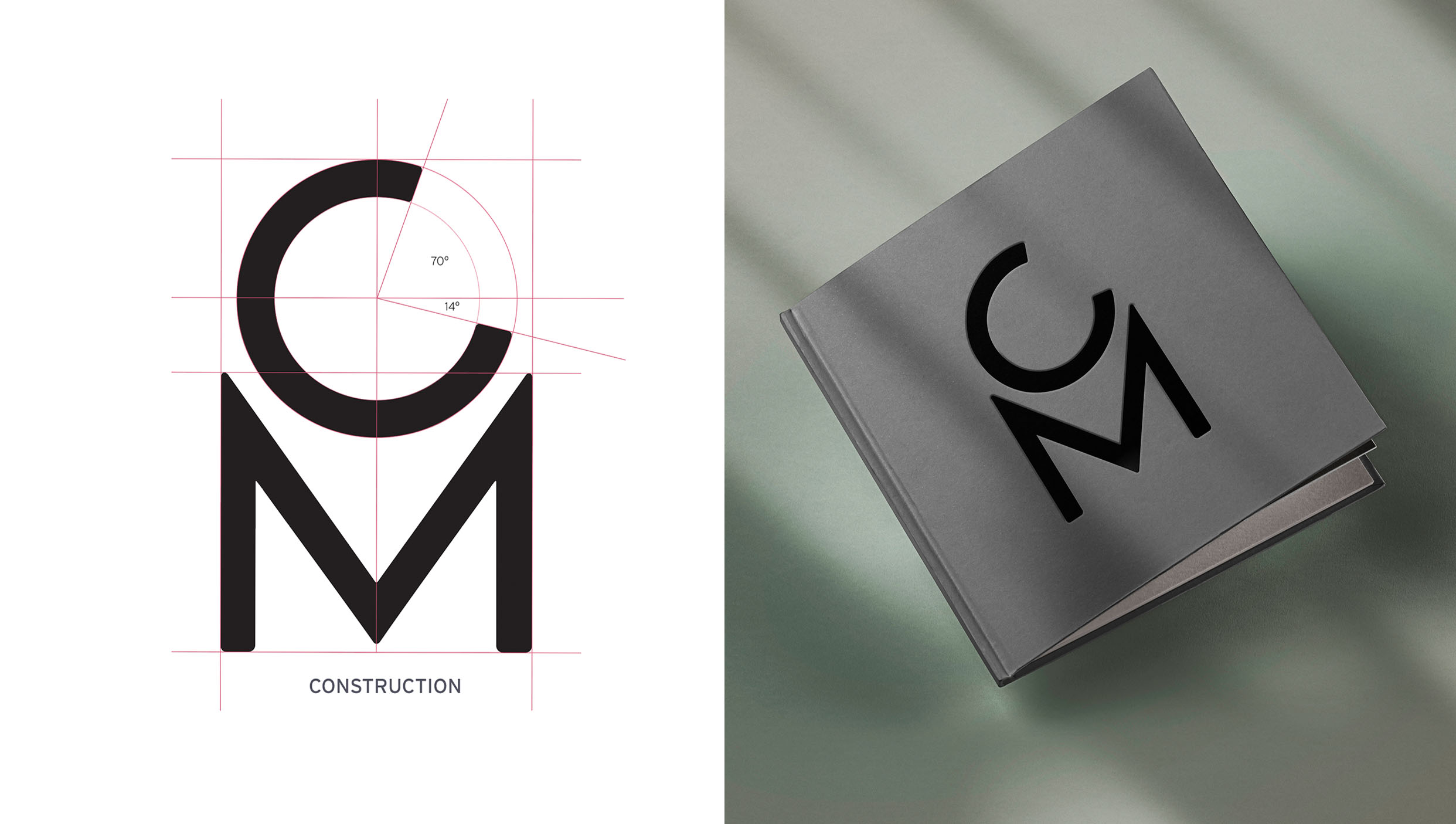
Carmen's work explores the nuances of textures, colors, and shades. I focused on creating a frame for her art — a simple, timeless brand with multiple elements that allow her vibrant, textured prints to take center stage. The typography is inspired by simple geometric shapes with soft, rounded edges. The monogram is bold and playful, symbolizing the harmony of the earthly and the inspirational: the 'M' is grounded, representing the material world, while the 'C,' like a crescent moon, hovers above, reflecting the source of creative inspiration.
This versatile monogram is designed to be widely used across various applications, from garment hardware and trims to different materials and finishes, seamlessly integrating into her clothing, bags, and shoes. It serves as a signature element that ties together all aspects of her brand's visual identity.
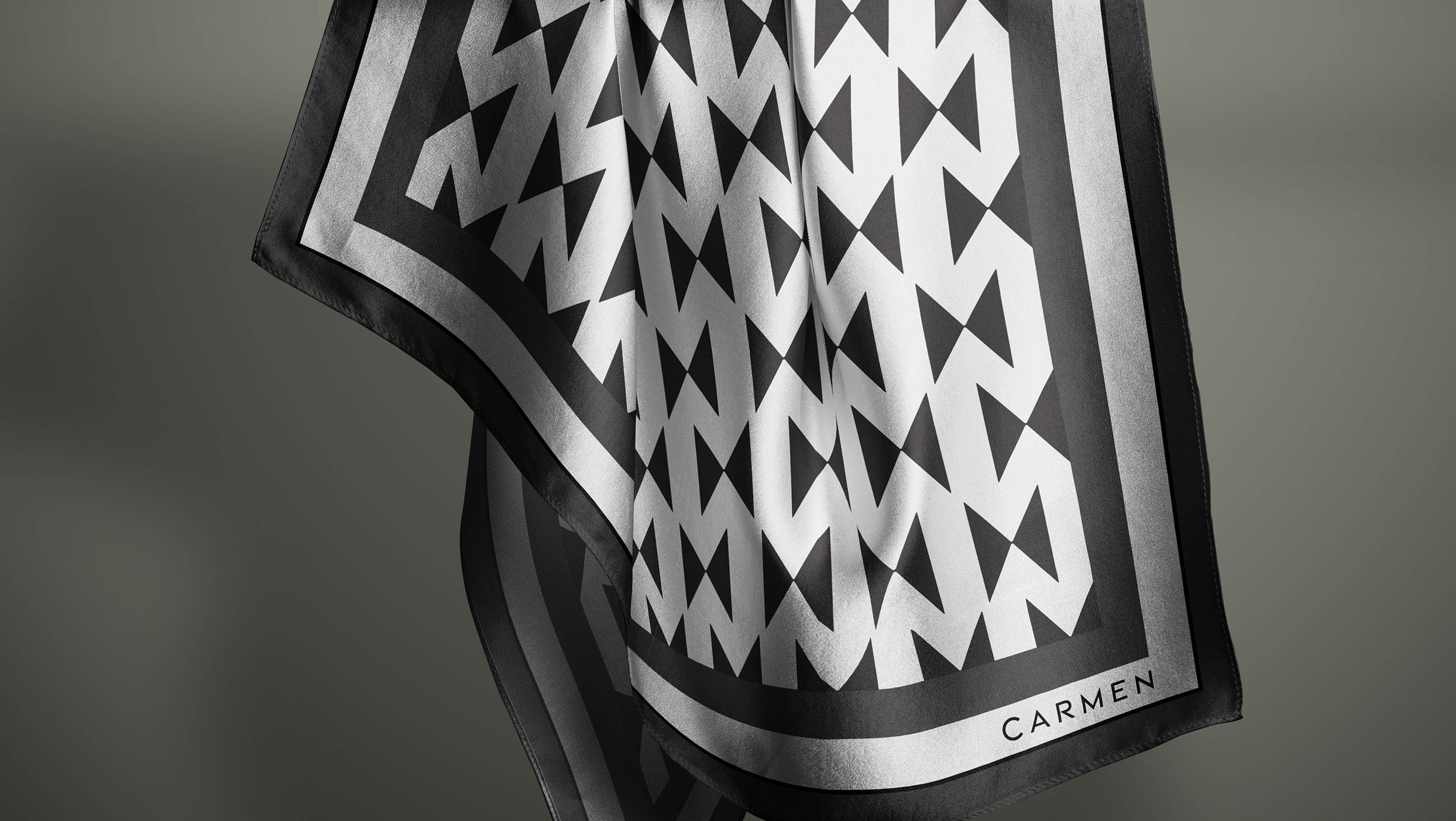
Disclaimer: The silk products shown in this portfolio are conceptual designs intended to illustrate the potential applications of the branding I created for Carmen. They are not actual Carmen products.
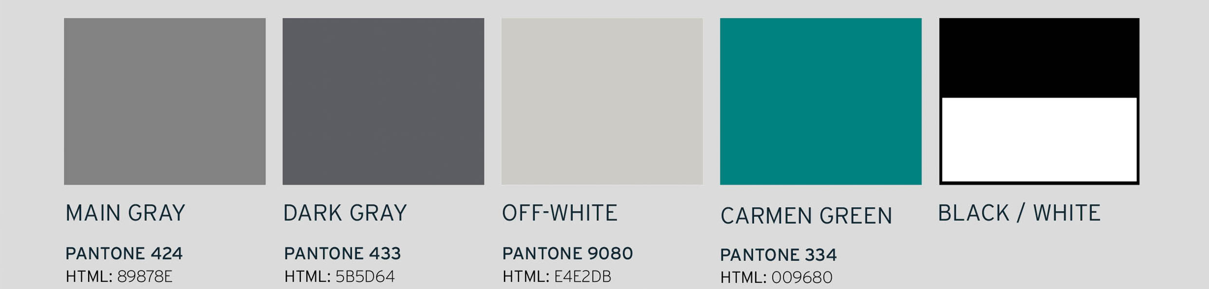
Sticking to the concept of a brand that acts as a frame for her art, I chose middle gray as the primary color—a tone often used in photography for its neutral, balanced backdrop, allowing Carmen's vibrant textiles to stand out while maintaining harmony across all brand elements. In a similar vein, I chose the lightest weights of the Interstate font family, providing a clean and modern feel to the brand.